| PROJECT | : | Banjar House |
| TYPE | : | Residential |
| SIZE | : | 225 sqm |
| CLIENT | : | Confidential |
| LOCATION | : | Jakarta, Indonesia |
| STATUS | : | Completed |
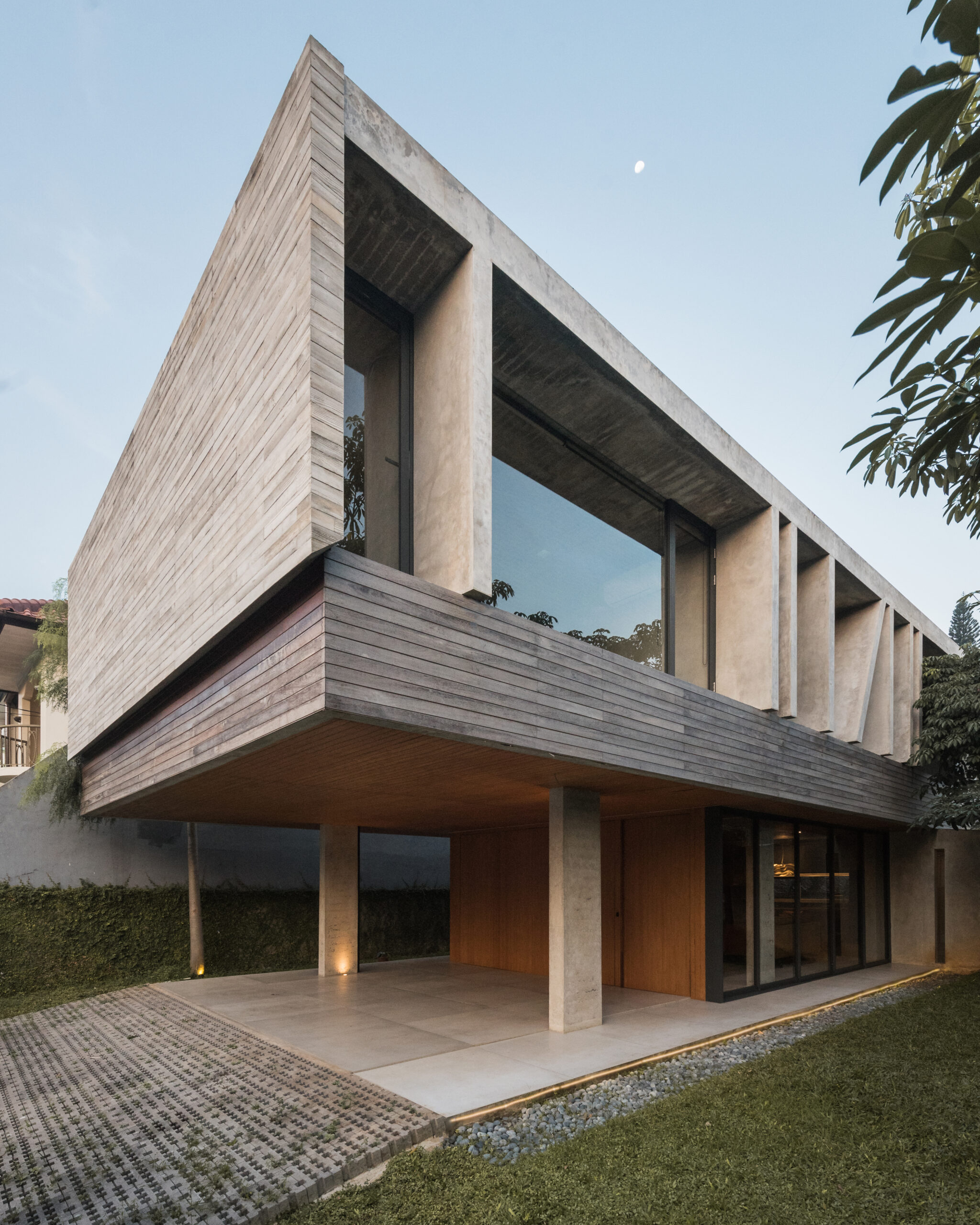
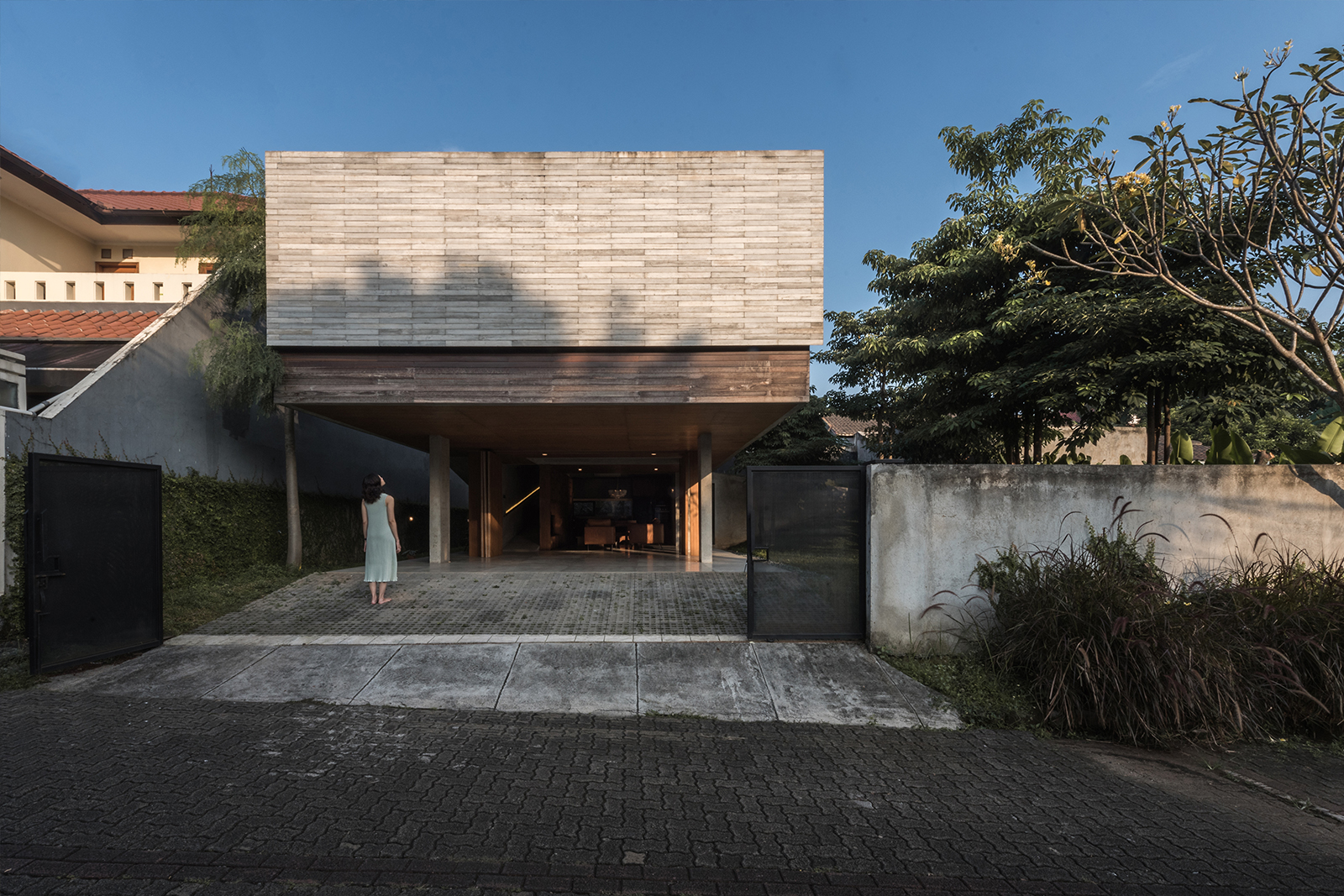
The project location is in the residential area of South Tangerang. The site is on the hook, so it has 2 exposed sides. Responding to the site orientation towards the sun, the layout of the building mass is maximized extending east to west with openings towards the north. The north side is a green area as a privacy buffer in the inner area. Meanwhile, the front facade area is a massive wall because it faces east.
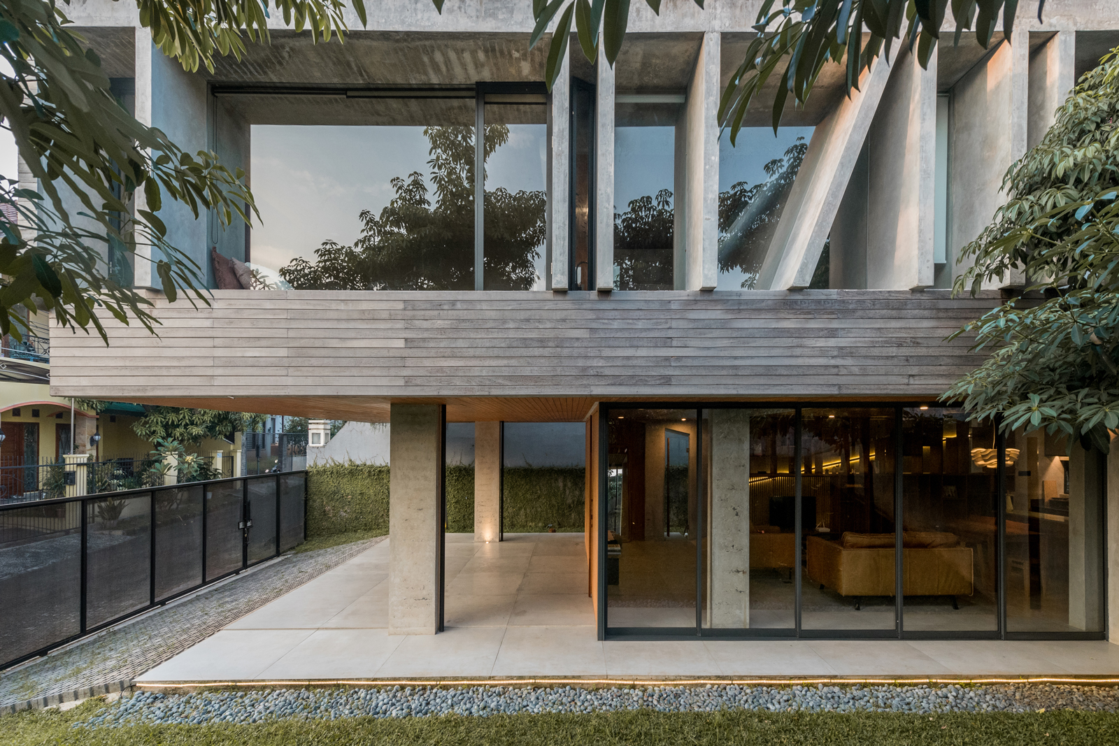
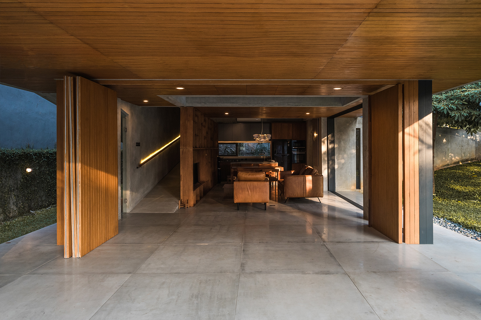
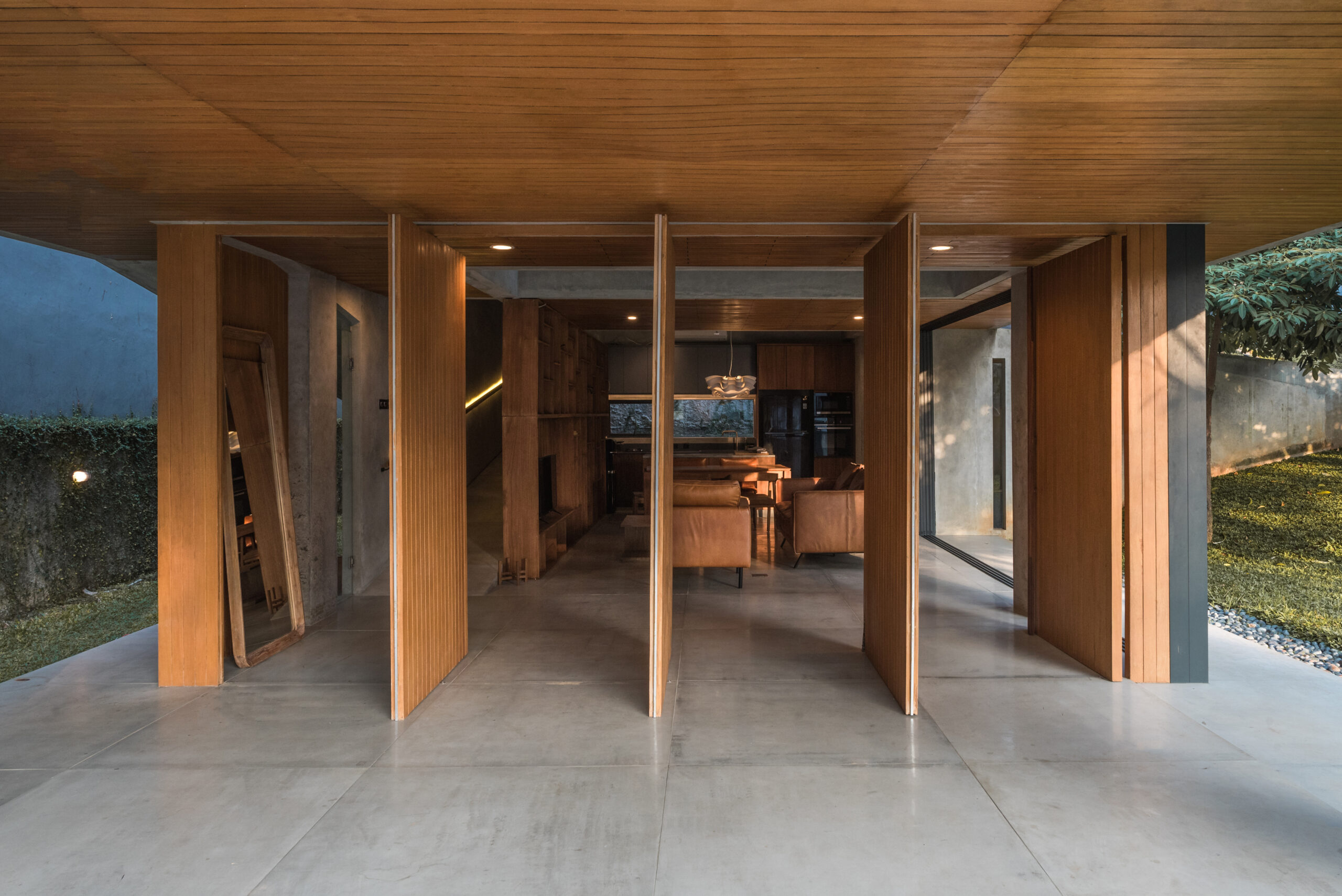
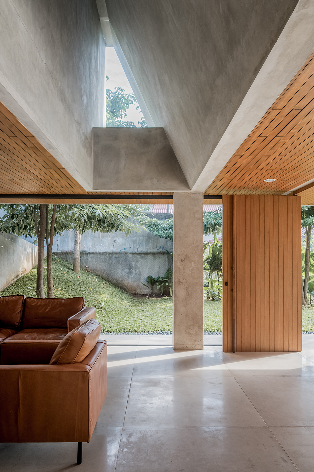
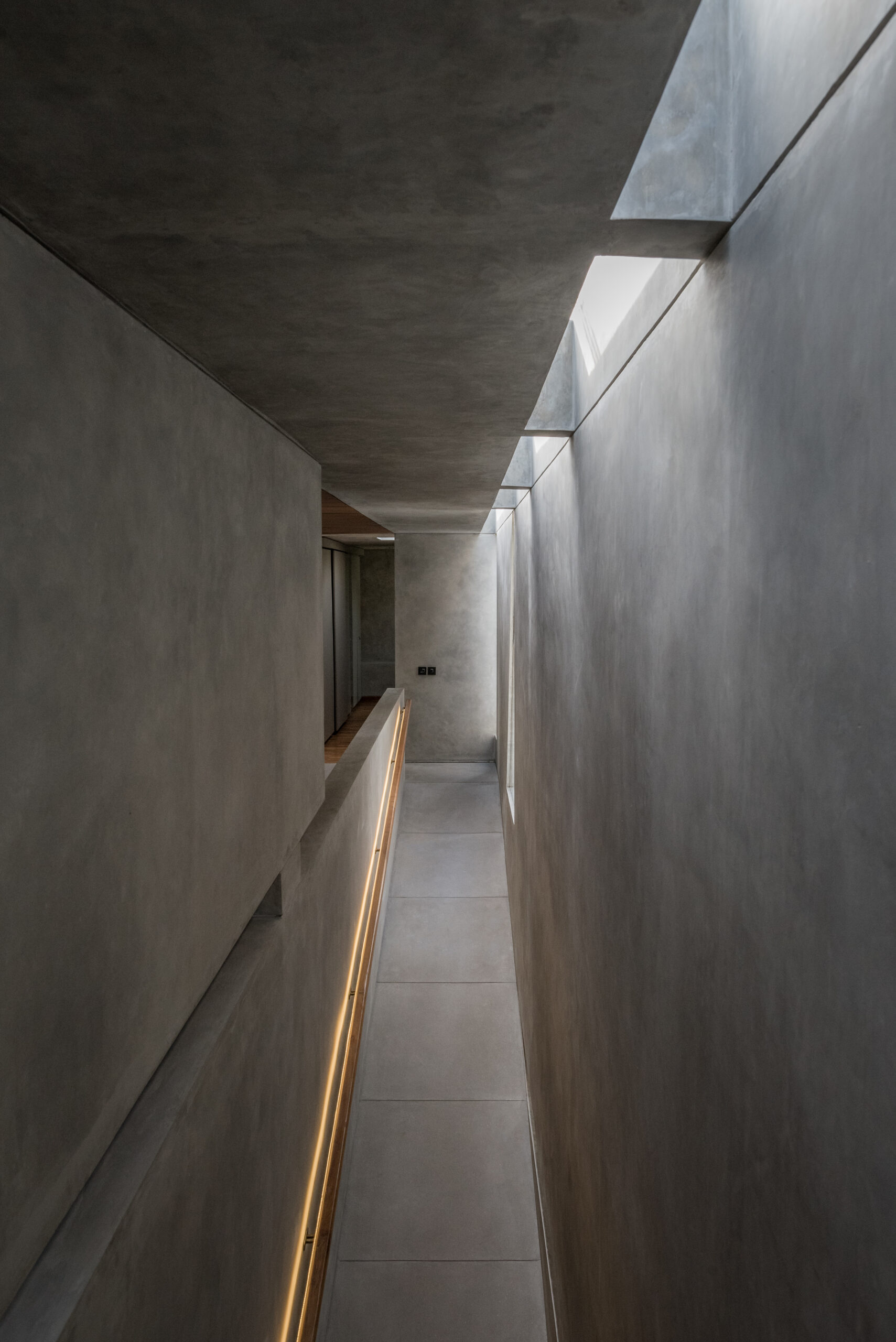
Banjar House has 2 floors; the ground floor is for public and service areas, while the upper floor is for private rooms. The ground floor is a living room, dining room, pantry and service area. The 1st floor consists of 2 bedrooms with attached bathrooms. Vertical circulation using ramps, as a more user-friendly architecture. On the ground floor, indoor and outdoor dividers are designed flexibly that can be folded as a space extension towards the terrace and garden to accommodate the need for additional space at certain times.
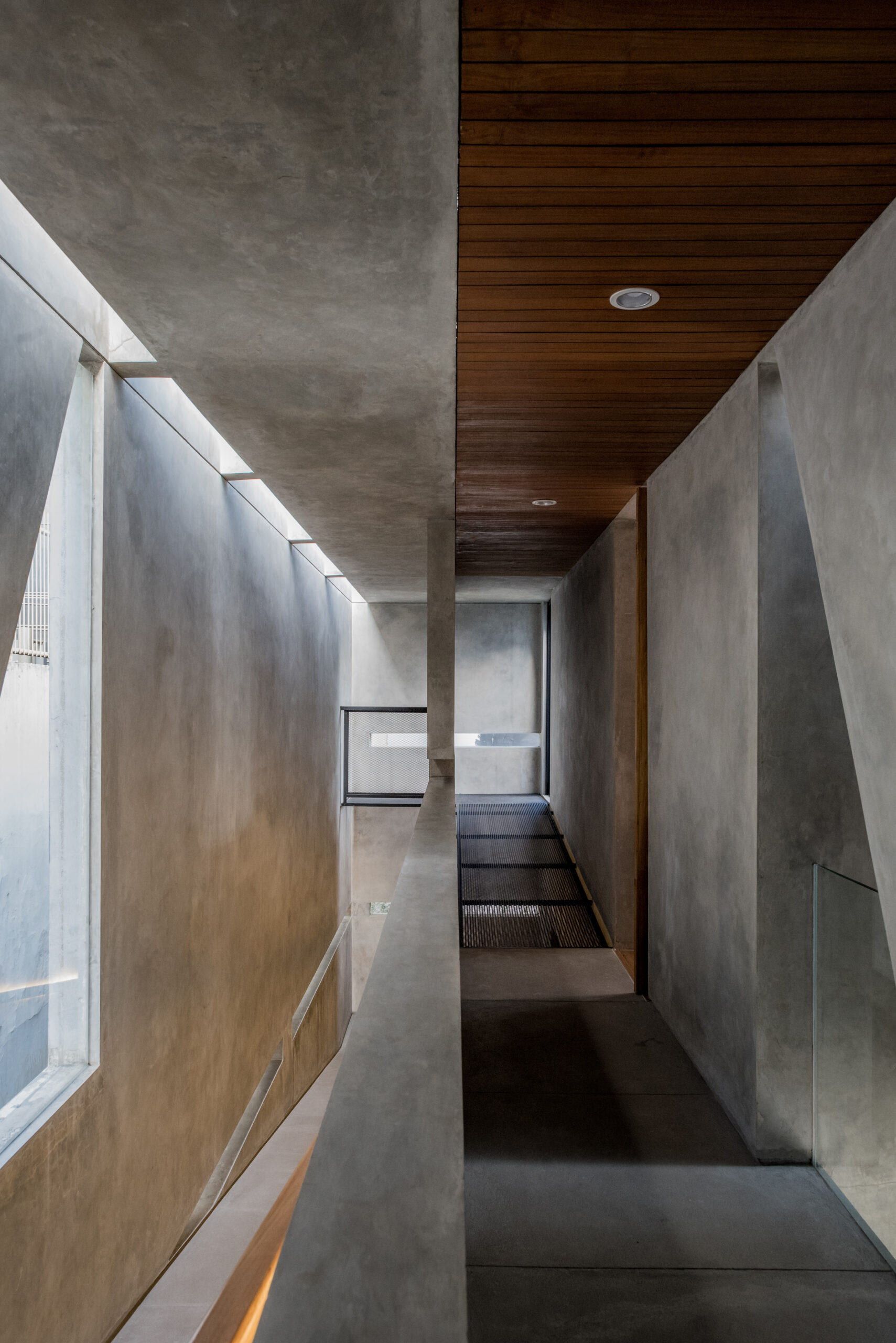
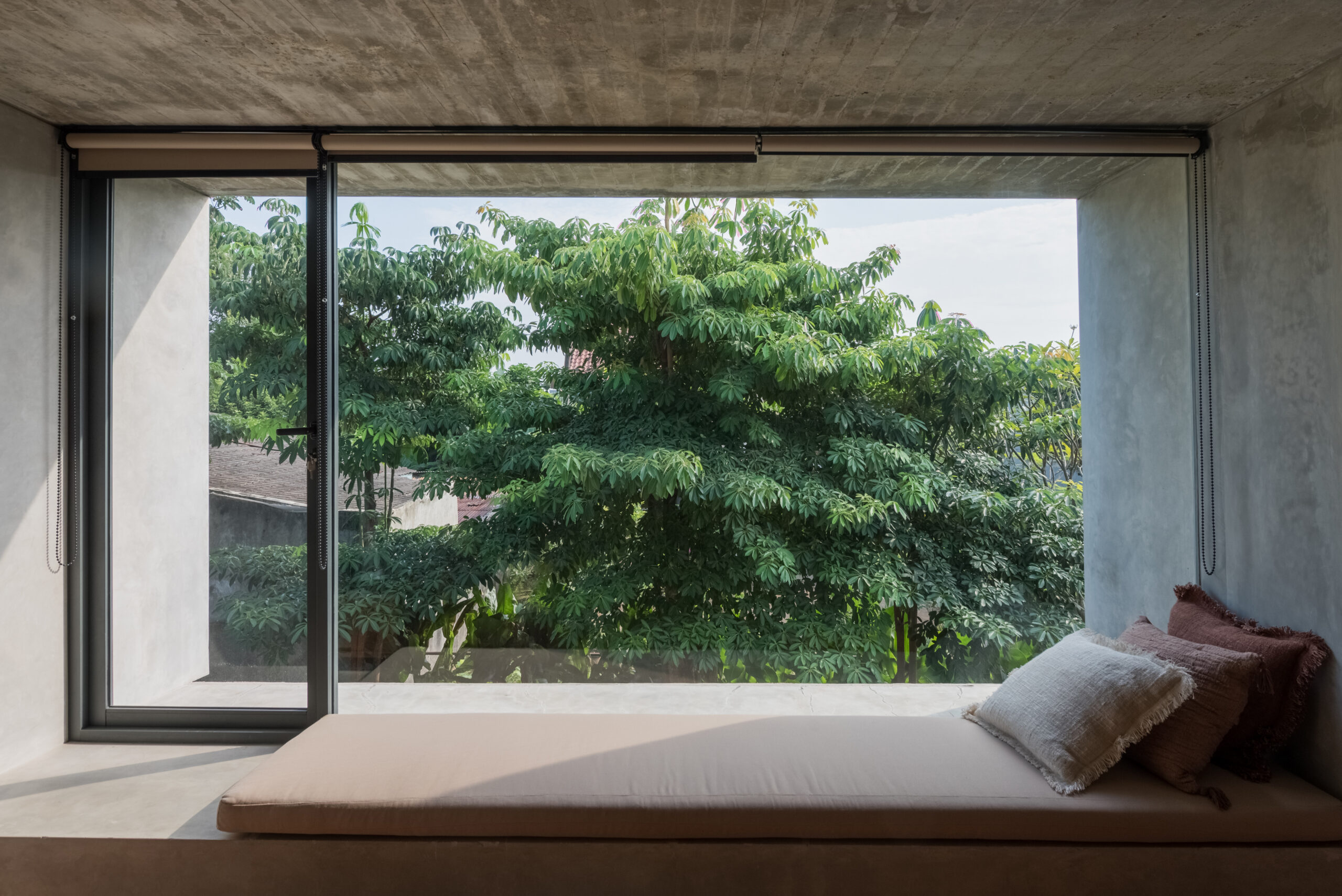
The circulation space utilizes natural ventilation and sunlight to create a tropical home concept. Maximize openings in every space with large windows for rooms facing the garden. And horizontal rips for circulation spaces, both on the walls and ceiling in the form of skylights. Each room has a view towards the garden with wide openings. The green space is designed linearly from front to back, continuously from the ground floor to the roof of the service rooms.
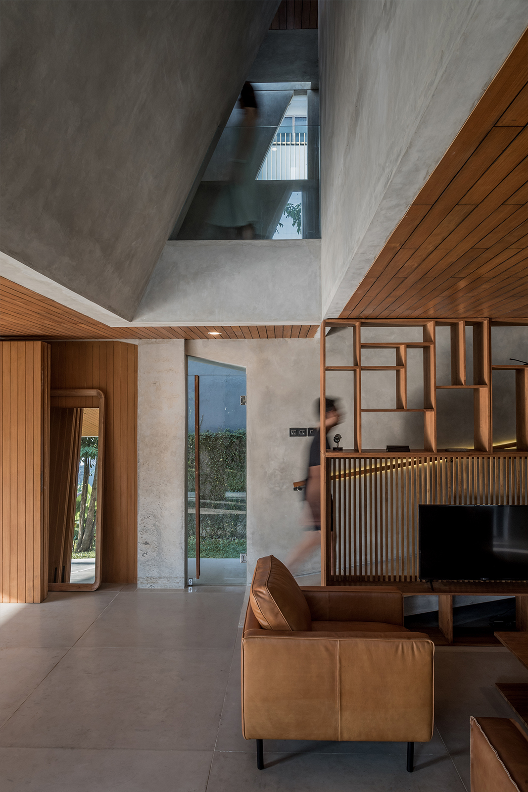
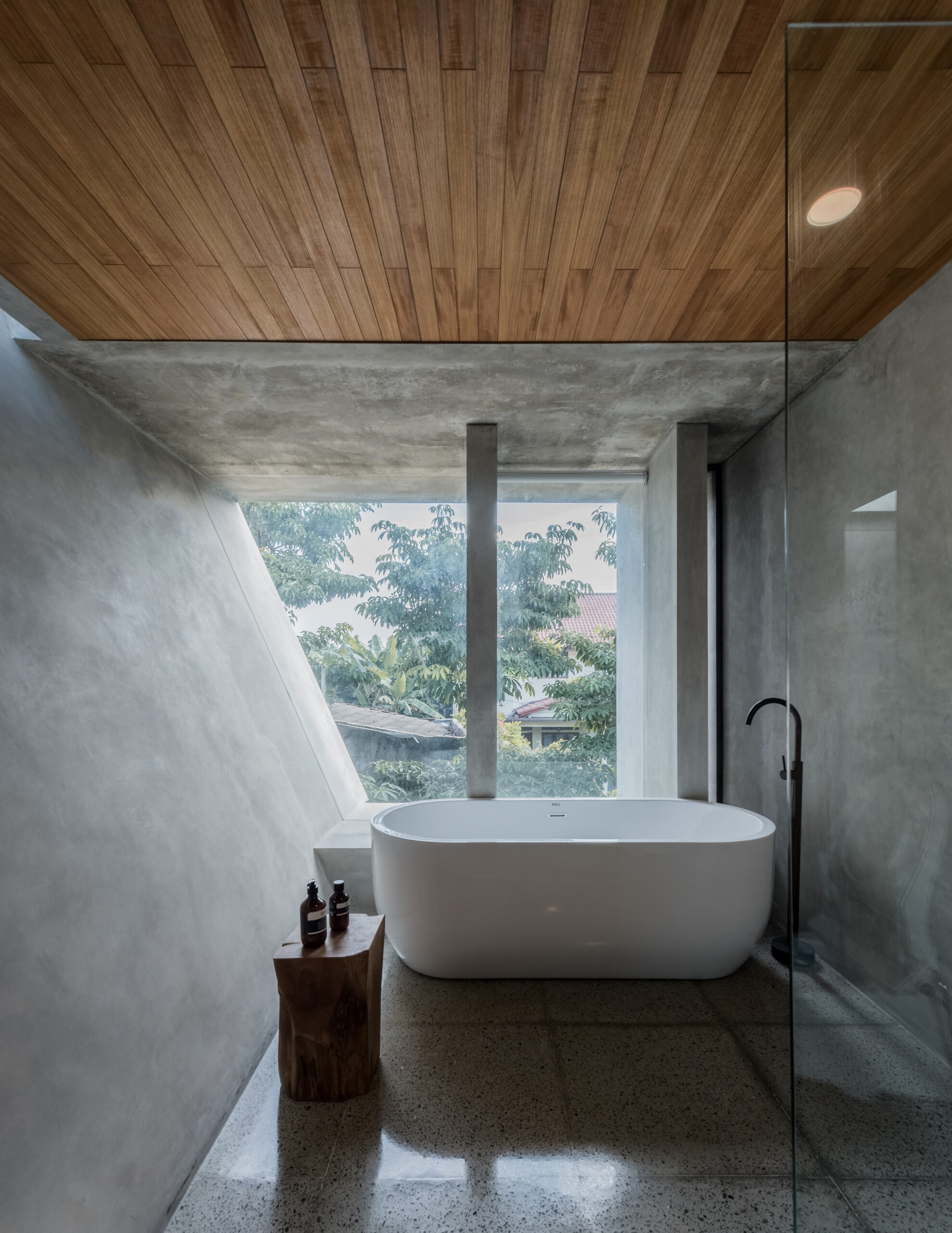
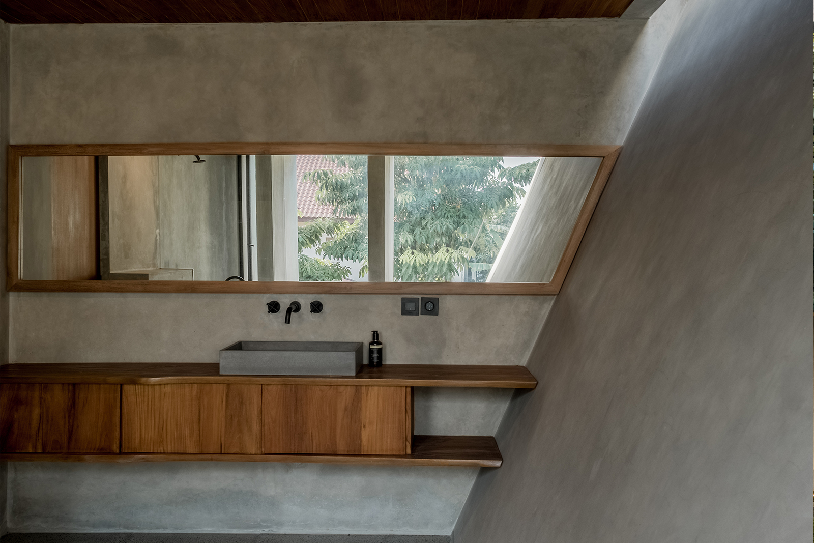
The materials used in this project are concrete and wood. On the east side of the facade, the concrete is molded with a wood texture. Thus the repeated lines between the molded concrete and the wood planks create the same texture. Exposed materials are applied to every element of space, both in vertical areas such as walls and furniture, as well as horizontal planes such as ceilings and floors. The consistency of the material gives a strong characteristic to the space so that it feels warm and cold at the same time.
The first impression in the entrance area is made high and bright by the presence of a sharp continuous void covered with glass that lets light into the space. The sloping wall that is created gives a broad impression to the space that borders the void, the master bathroom. This affects the outer area, the sloping walls between the repetitions of the vertical walls create a visual contrast to the facade.
